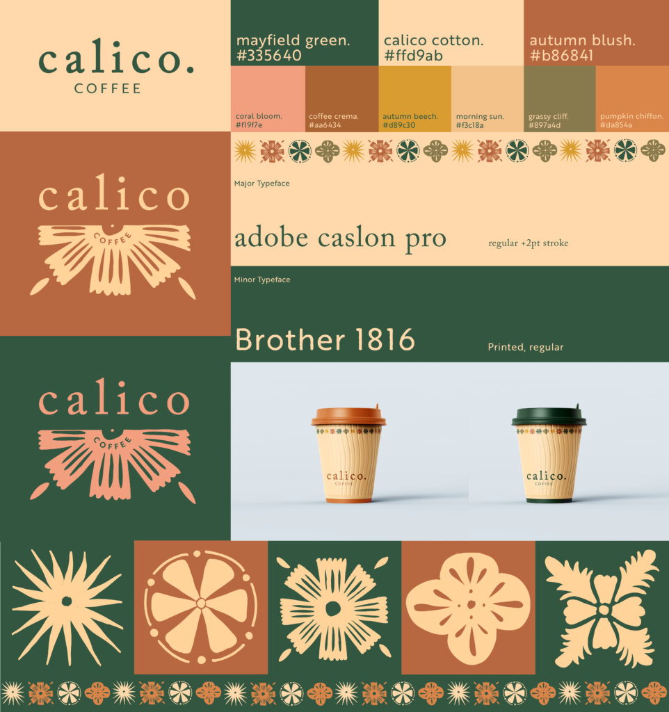
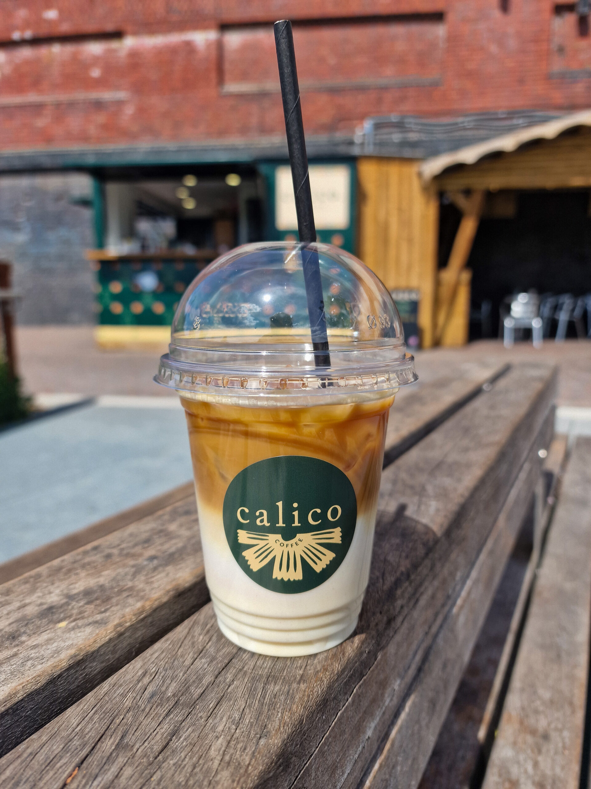
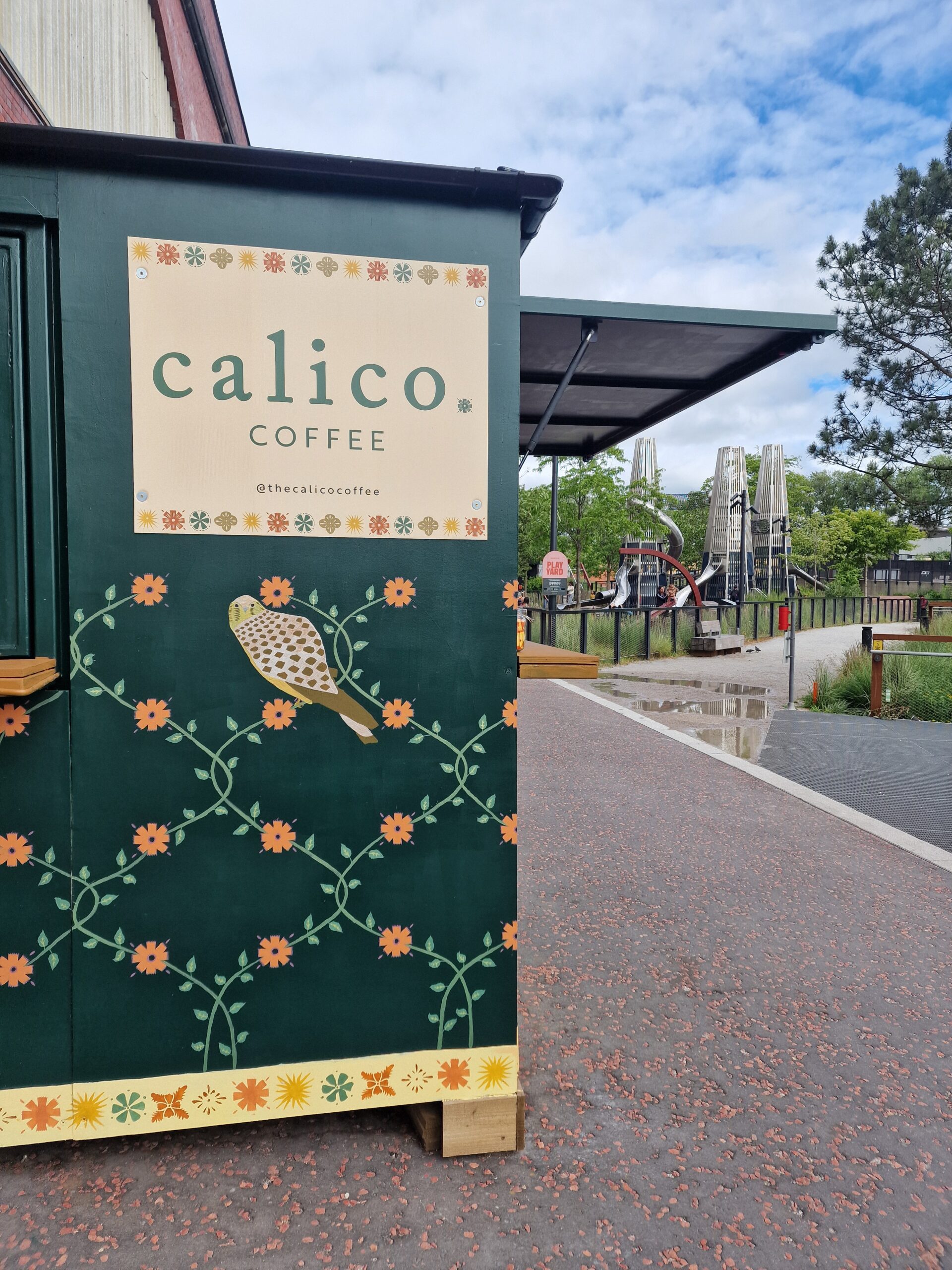
The client needed an identity for their new coffee shop opening in a modern park in Manchester. The site was a very important part of the project as the park was rooted in history as a place “for the people”. Today the park is privately owned but open to the public, and the developers want to utilise the space to promote its sense of history, community and pride in green spaces. My client needed their branding to fit into these themes. So, taking inspiration from the original infrastructure which was housed on the site: a print works, I incorporated florals and natural colours from the park to create a patterned identity for Calico Coffee, represented best by the coffee cups.